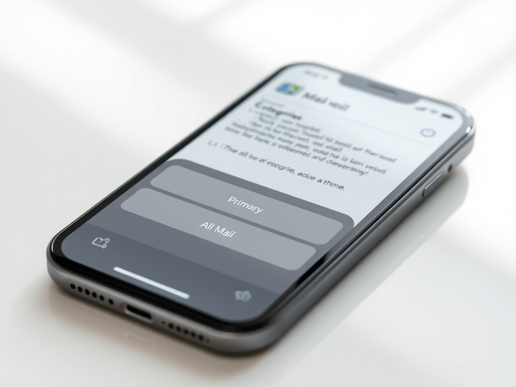
Apple recently introduced a new choice in the Mail App on the iPhone and iPad, called mail categories which, later, also became available on the Mac. The device categorises the emails you received and separates them out into ‘tabs’. For instance time sensitive emails would always show in the Primary section of the inbox. An email newsletters would be hidden listed under the ‘Updates’ section.
In theory this is a really useful change to an App that we all use daily. This provides a solution to the information overload that most people’s inboxes have become. Nonetheless, very soon after the introduction on the iPhone I noticed clients struggling with the change.
Ignoring Sections
Most of the feedback I received from users was they were ignoring the sections. After receiving the tool-tip to explain categories and dismissing it (almost reflexively), the idea seemed to quickly leave users minds.
Most stayed on the primary tab, not exploring the others available. More worryingly, several users told me they were unable to find an email they were expecting. They had to retreat to using Mail on the laptop. Fortunately, in this instance a couple of users had laptops which were not new enough to run the Categories update.
Unusual use of UI
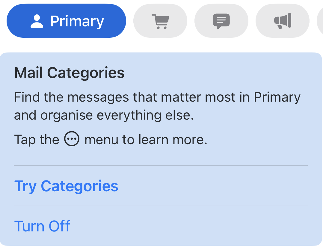
Look closely at the categories UI. You will see that a section ‘button’ or selector can just be seen at the far right of the list providing the impression that there is another mail category available. Swiping on the button row from right to left reveals an ‘All Mail’ category. This idea of hiding functionality seems at odds with Apple’s usual intuitive design.
Showing this gesture to several users definitely encouraged them to keep mail categories on.
User Interface
Approaching this new UI from a developers viewpoint, I view the categories selection rather like a segmented control. Yet, unlike a segmented control, tapping on the currently selected category deactivates it. It returns a user to the All Mail tab. This is at least a good way to discover the extra view. I noted in practice that several users tapped on All Mail again as they wanted to make sure they had All Mail selected. They were then returned to the Primary category list. A segmented control would have left them at All Mail, which is what they wanted.
Discoverability
The introduction of Mail Categories in the iPhone seemed contrary to Apple’s historically renowned intuitive user interface. User feedback indicating confusion about this feature further supported this observation. I conducted an online search. I found the first page of search results predominantly populated with “How to turn off Mail Categories” posts. This suggests that others perceived the introduction of Mail Categories as not providing a tangible advantage.
Leave a Reply