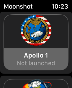
Mostly everything works quite well on the watch. Because of the screen size we only end up with one column in the LazyVGrid, but this is fine and allows the same code to run on other devices without modification.

However, the NavigationLink on watchOS by default uses a background colour, and this also tries to add padding around our VStack. To get around this I added the following modifiers to the NavigationLink label:
.padding([.horizontal,.bottom])
.buttonStyle(.plain)
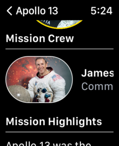
When creating the MissionView.Swift view I noticed that the mission image and title were not appearing as shown on Paul’s video and the iPhone preview. The image didn’t appear to be centred on the screen. Instead, I need to specifically add .frame(maxWidth: .infinity) to the first VStack surrounding the mission image.

I also removed the .padding(.bottom) from the VStack holding the Mission Image and Description. This was placed in the code by Paul so the text would not fall under the Home Indicator on the iPhone. However, it was leaving too much screen unused on the Apple Watch and therefore was not necessary.
Finally, I chose to move the Astronaut list higher up the display, as the smaller screen of the Apple Watch gave the impression that the mission screen just ended with a block of text. You would only seeing the list of astronauts if you scrolled all the way to the end of the mission description.
Having them above this, seemed to be a better UI on the watch.

Leave a Reply